This chronological review of the various signatures and marks appearing on Cybis porcelain sculptures may be useful when trying to “date” or verify the authenticity of a given piece. Sculptures that were created during the 1940s transitional period (from Cordey to Cybis) can present challenges because some of the signature styles or colors used at that time would be red flags if seen on a later piece. There was an indeterminate number of years in which the output of both lines coexisted, and the earliest Cybis pieces clearly show their Cordey heritage. By the way, the correct spelling is Cordey – with an ‘e’ – not “Corday” as is sometimes seen from online sellers. However, the actual pronunciation as set by Cybis themselves is “corDAY”. (And there was indeed a company named Corday; they made perfume during the 1920s-1950s and their vintage bottles have become collectibles.) Examples of Cordey sculptures are often described online as “Cordey Cybis” even if the piece being offered bears only the Cordey mark.
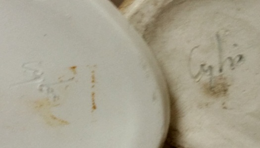
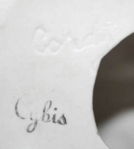 This example of a dual signature (Cordey mold impression plus Cybis signature stamp) is found on a circa-1940s cat done in Cordey style.
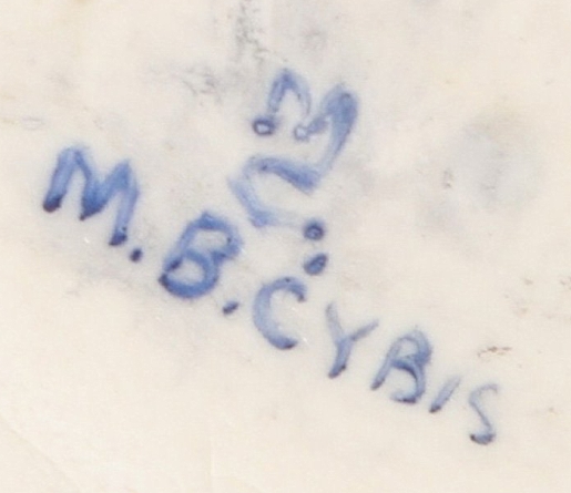
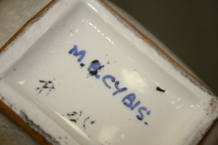 The M.B. Cybis signature stands for “Marja and Boleslaw” – appears on a number of items that were made during the 1940s; an upcoming Archive post will collect them all in one place. This blue paint was used for many Cybis signatures during the 1940s and 1950s.
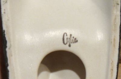
 This signature is an abbreviated form of the M.B. Cybis signature, i.e., a monogram form.
 The vertical MC is the monogram for Marja Cybis. Here it appears in combination with the M.B. Cybis signature. MC pieces are from the 1940s; I’ve never seen one on a 1950s item.
 The back-to-back letter C monogram, dating from the 1940s into possibly the early 50s, probably represents the two Cybis artists (husband and wife) working together.
 The problem with the painted monogram is that it doesn’t accurately represent the same mark that was occasionally used as a mold mark; as shown by this raised impression that appears on a cat piece, the letters actually overlap instead of being back-to-back as in the Cybis catalog depiction of it. In fact the mold mark is eerily close to the Chanel’s interlocking double-C logo, although the Cybis mark is more vertical. The cat bearing this mark dates from the 1950s but I would guess most likely the early part of that decade.
 This painted B(oleslaw) Cybis signature dates from 1953-1957 and has been found in blue and in a reddish brown.
 Most of the 1950s pieces, especially the religious ones, have the stamped Cybis signature (name only). Commonly it is in the blue or brown paints shown above but occasionally also in a dull pinkish color or a dark charcoal grey; these could well be faded from red and black. As can be seen from the examples above, there was also a two-line Cybis Fine China stamp as well although those examples are seen far less often than just the Cybis name stamp alone. This particular 1950s Cybis name stamp font is one of two known; I call this one ‘Style A.’
Special Note: Some Cybis pieces bearing this Style A name stamp were NOT made during the 1950s! Please see the Old Signatures on New Pieces post for details and how to tell the difference.
 This stamp is slightly different from the one shown above; this one is on a pheasant from the 1950s. Notice the difference at the top of the C and the lower part of the Y. This style of 1950s name stamp is the one I call Style B.
 This bright red stamp is on a 1950s religious figure of a young Jesus with gold skin.
 Here’s a signature anomaly that I’ve to date seen only once: a raised Cybis signature mold mark! It appears on the same 1950s cat piece that had the raised double-C mark. The piece also has the reddish-brown “Cybis Fine China” stamp on it as well. It may well be that the two raised marks were only used for a very short time.
 Some of the 1950s Cybis items have a signature that is incised (recessed) which appears to indicate that they were signed during the greenware stage (before the first firing.) As shown in these two examples, sometimes the signature was gone over with paint in the final stages but at other times left plain as in the left-hand example.
 According to the 1978/79 Cybis catalog, the use of this block-letter mold impression began in 1945 but they did not indicate an ‘end’ date. Most examples were simply pressed into the mold at the greenware stage, but some (as in the example above) had paint later brushed into them.

 This eagle mark supposedly has a very specific date range of 1947 to 1951 according to the Cybis catalog. It can be found in either blue or black/grey, and also as a mold impression as shown in the second image. The cited dates may be flexible, however, because an Angel in Adoration has been found bearing this mold impression despite the fact that the same Cybis catalog lists her as not being introduced until 1953! So one or more of those production dates (either for the stamp or for the angel) may not be exactly accurate. It’s probably safer to say that the Eagle mark in one form or the other was used “in the late 1940s and early 1950s.”
This AMERICANA mark was used only on the spatterware and historical reproductions, and not on every piece either. This photo of the mark is courtesy of the New Jersey State Museum and appears on the back of a schoolhouse-motif red spatterware plate. See my June 2025 post revealing the discovery of the D’Orsay China and Americana brands.
The U.S. citizenship applications filed by Marja and Boleslaw Cybis reveal something surprising about the origin of the original (earliest) 1950s signature stamp: It is Maria Cybis’ signature, not Boleslaw’s!
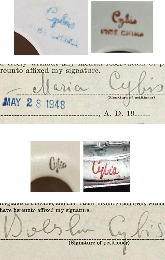
This graphic shows that while the second known Cybis signature stamp is closer to Boleslaw’s – yet not a match – the original signature chosen was actually Marja’s.
Modern (Hand Painted) Cybis Signatures
The familiar script-format handwritten Cybis signature coincides with the appearance of the first pieces that reflect the post-1950s Cybis style, moving more toward bisque pieces and away from the highly glazed rococo look that had been a hallmark of Cordey. It is at this point that the signature began appearing more and more often in brown, and by the early 1960s the brown (or gold leaf, in certain cases) became standard.
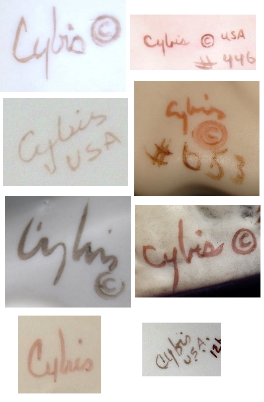 The examples above show the possible variations in style between the modern Cybis signatures. Note that two of them are in a shade of brown that closely approximates the charcoal that was used on the early stamp; however, the most common paint color is the typical mid-brown, or the aforementioned karat gold paint especially if the signature has to be placed on a dark background.
 Here’s an exception to the “always-in-brown” modern paint signature rule, on the Twelve Drummers Drumming holiday ornament released in 2000. I have only seen one of these offered for sale and so have no idea whether all of them were signed in this color; also, the actual colorway of the piece is different from Cybis’ own stock (advertising photo). (Both colorways are shown in the Twelve Days of Christmas post.)
 This unusual black hand-painted signature appears on a Wendy; because that sculpture was an open edition it cannot be dated individually but the design was introduced in 1957. It is possible that this particular one was made when the studio first abandoned the stamped name and switched to hand signing after Marylin Chorlton took over in 1957.
 If a sculpture consists of two separate figures joined together on a single base, each figure will have its own signature. The sculpture of two unicorns called Gambol and Frolic is an example of this, the underside of which is shown above; each unicorn is signed on the inside of the right rear thigh.
 It should also be mentioned here that the copyright designations of © or ® (in this case the ® means that the phoenix impression is a registered trademark of Cybis) may be either handwritten or stamped. Either is legitimate but they are always done in the same paint color as the Cybis signature they accompany. Some sculptures may have the copyright and/or registered trademark symbol as a mold impression instead of, or in addition to, a painted/stamped one.
Also, the so-called “bird mark” (as many online sellers refer to it) mold impression changed in 1979 from the single phoenix to the phoenix-arising-from-flames shown above. A vertical version of this design appears on the cover of the 1979 Cybis catalog.
Signature Anomalies and Curiosities
You didn’t think that Cybis signatures would be 100% consistent, did you? Here are some examples found thus far.
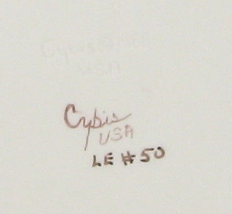 Normally there is no limited-edition indication on a sculpture other than the # sign followed by the individual sculpture’s number (if the # appears at all.) However, I have found two instances of it being written as shown above (LE meaning limited edition) on the Scheherazade sculpture. If any readers have a Scheherazade, I would be interested to know if it does or does not have the “LE” designation because that is the only piece that I have ever seen this written on. It may be that for some reason they were all marked in this manner, but why it would be this particular sculpture and none other is a mystery.
 This early 1980s non-limited edition Madonna, Queen of Peace may contain several signature variations, so let’s look at them.
 This example has the phoenix-in-flames/registered trademark mold impression, plus a handwritten Cybis signature, a stamped copyright symbol, and the unusual “Made in USA” as handwritten in full. Typically it would simply be written “USA” or the Made in USA would be applied as a mold impression. Even more unusual is the handwritten production date (1980). The two circular areas at top and bottom are small holes that would normally be open.
 This second example is similar but does not have Made in USA on it in any format; it does have the extremely atypical production year date in paint.
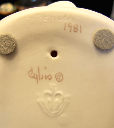 The third example has Made in USA as a mold impression this time, so it is not handwritten….. but now the handwritten date is 1981! On this sculpture the copyright symbol was written rather than stamped, and the firing holes are open as they should be. The felt circles were probably applied by the owner.
 Another atypical signature appears on the limited edition Prima Ballerina; the notation “Trenton, N.J.” appears in paint. The only other sculptures that I have so far seen this on have been the Collectors Society pieces and one of the Display Signs. However, there may be other examples of the ‘Trenton’ signature not yet discovered.
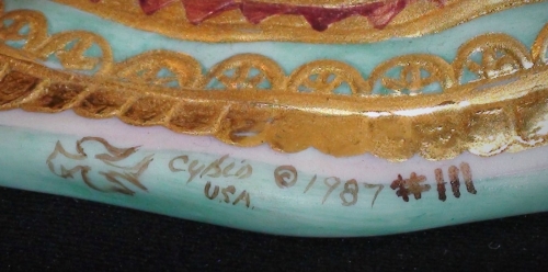
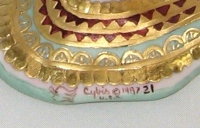
The award for Really Weird Signature Format thus far has to go to the pieces that for some odd reason have a hand-painted phoenix logo. Below are three examples from the Queen of Sheba, all signed the same way on the back edge of her robe.

 I would love to know whether the phoenix mold impression also appears on the bottom of the sculpture; if any reader has a Queen of Sheba, would you please take a look and let me know? If it is there in the mold, I can’t imagine why they would want to add it again in paint; and if it is not in the mold, I can’t imagine why this would have been omitted when every other Cybis piece has it.
 The signature on Theron contains another new element as well: the trademark designation T.M. applied in paint. The phoenix is also portrayed with the wings in a different position which makes it look more like a dove and not at all like the trademark Cybis phoenix shape. This “profile” phoenix shape corresponds to the latest iteration of the Cybis mold impression which is shown in the next example.
![]()
![]() Here’s a third version of the hand-painted phoenix logo, this time as upright rising from the flames. These two pieces were among the items in the studio’s liquidation sale in late 2019. The upper example is on a Percy pig which was a retail item, but the other one is on a Morning Glory study which was never a retail release.
Here’s a third version of the hand-painted phoenix logo, this time as upright rising from the flames. These two pieces were among the items in the studio’s liquidation sale in late 2019. The upper example is on a Percy pig which was a retail item, but the other one is on a Morning Glory study which was never a retail release.
Name Index of Cybis Sculptures
Visual Index (for human figures and busts only)
About the Cybis Reference Archive
What is Cybis?
Images of Cybis porcelain sculptures are provided for informational and educational purposes only. All photographs are copyrighted by their owner as indicated via watermark. Please see the copyright notice in the footer and sidebar for important information regarding the text that appears within this website.
The Cybis Archive provides the most comprehensive range of information about Cybis within a single source. It is not and never has been part of the Cybis Porcelain studio, which is no longer in business.
