A perennial staple of modern (post-1960) Cybis advertising was always that ‘no two [are] exactly alike’ ….. but what does “exactly” mean in this context? (We will step gingerly away from any comparison to responses along the lines of “It depends on what the meaning of ‘is’ is.”) Seriously, though: When it comes to art porcelain, and Cybis in particular, how much of a difference qualifies as being a difference? A physics professor of mine was fond of saying “A difference that makes no difference IS no difference” but we’re talking about art here rather than science. And I’m not entirely sure I agreed with him on that point anyway. :-)
With Cybis there are two categories of how individual sculptures within the same design can vary: In design elements, or in painting.
A quick but necessary clarification: In the context of this post, I am not talking about pieces that were one of a kind (custom colors), or artist proof test pieces or experiments, or special variations that were deliberately created for a retail gallery event, or separately named retail pieces created by adding an element to a previously released sculpture (the Bunnies are notorious for this), or a deliberate change of color midway through a design’s production run. There are very few of this last, notably the Folk Singer whose pants color was changed from blue to yellow (or vice versa; nobody seems to know when the swap occurred or why!)
Differences in Design Elements
This type of variation is far less common and all known cases (to date) took place in the first few years of the Marylin Chorlton era. The changes are minor and could have been due to production issues or simply to a change in design aesthetic (“You know, I think this piece really would look better with _____ instead.”) Such changes can help to date the piece to an earlier versus later stage of production.
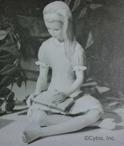
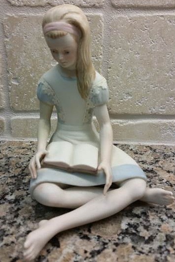 Alice in Wonderland was introduced in 1964 and underwent a slight dress re-design before being retired in 1969. The upper photo shows the initial version with ruffles on her sleeve edges and a wide lace trim on the hem of her dress; the lower photo shows the much more common re-design that eliminated the sleeve ruffles and the hem lace but added lace trim to the sides of her ‘jumper’ instead. My guess is that the original ruffle and lace were not performing well in the kiln or were undergoing too much breakage in transit to retailers. (The years cited refer to the color version; there was also a white bisque version made only from 1964 to 1965 but I have never seen one. My guess would be that it probably has the original dress styling.)

 Production problems were no doubt the rationale behind the change of the interior of the Christmas Rose flower (1965-1970.) The upper photo shows the earlier version, with the anthers longer, thinner and a bit more widely spaced; the later version shows them now shorter, stubbier, and presenting a more solid (although less natural in my opinion) appearance. It’s unclear whether the stigmas in the very center were deliberately shortened in the re-design or whether this and many other examples have had them broken off over time.
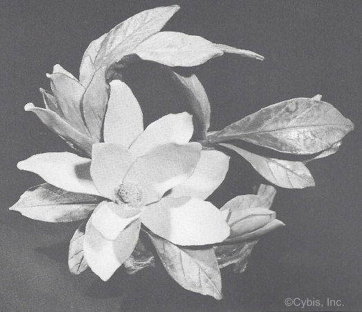 The Magnolia underwent a more noticeable change during its sixteen-year production run that began in 1963. Because this was a non-limited edition these changes are the only way to somewhat assign a given piece to “early” versus “later.” This is the original version which may have been produced for as few as one or two years. The petals are graceful and have tips that almost come to a point but not quite.
 The version shown in the 1967 Cybis catalog displays a re-designed petal shape that is very rounded.
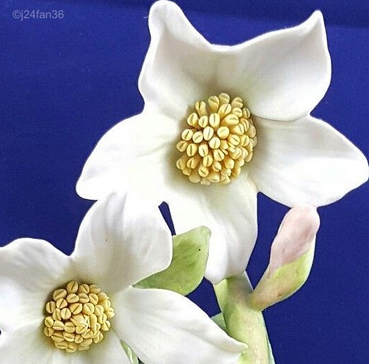
 This post-1967 version has spoon-shaped petals. There are also differences in the central portion that are more fully examined in the Flowers post.
Differences in Painting
Whereas the design variations were a result of a ‘top level’ decision, the painting differences were what the studio really meant when they said “no two exactly alike.” Many of the differences are subtle, although most noticeable in the human figures’ faces. But sometimes the contrast between “typical” and “not so typical” is more dramatic; this could – and often did – make the difference between a collector choosing one piece over another. (Take a look at my Snail Tale post for a confession of how crazy I used to get in this regard!)
Painting variations usually depended on a given artist’s whim and/or skill but could also happen as an unexpected paint color change of behavior during the firing process.

 A quick mention here about differences among the 1940s Cordey pieces: In most cases this was intentional which is why there is so much decoration variation in so many ways. But even when deliberately “doing multiples” there could be noticeable differences in the same color. Here’s the same blue-decorated lady bust: one a shout but the other barely a whisper.
 Eros is a great example of skin tone varying by artist. I have seen only a few of the suntanned version which I usually refer to as Beach Boy Eros!
 A more subtle but still noticeable side-by-side skin tone difference can be seen in these two Lady Macbeth sculptures. The one with the richer skin tone also has a darker hemline paint.

 A similar contrast in two Pollyanna pieces, in this case extending to one being a blonde while the other has light brown hair. Notice too that the floral pattern on her blouse is much more in evidence. The one jarring note is the apple – you would think that the darker red apple would be held by the richer-color sculpture, wouldn’t you? However, the apples were painted and fired separately and then affixed in place at the very end.
 When it comes to skin tone, Nefertiti positively drives me to distraction because the official Cybis photo of her does not display the orange – there’s really no other word for it – skin tone that 99% of the actual pieces do. The reason I don’t say 100% is because there may actually have been a few that were produced in a more normal color, if some photos don’t lie.
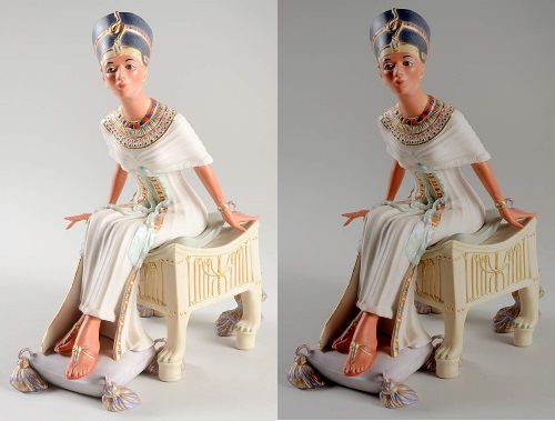 The problem is that photos can be prone to all sorts of misinterpretation in this digital world (and even before that.) The photo at left appears to show a Nefertiti matching the official Cybis advertising photo from 1979. However, it also displays a noticeable amount of glare, suggesting that the photographer either used flash or overlit/overexposed the photograph. There’s quite a bit of washout in that picture. A very quick adjustment in my photo editing software corrected the washout but also changed the skin tone. So what does that actual piece really look like? Who knows?? (and for the ridiculous price that the seller was asking for it, that is going to remain a mystery)
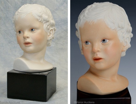
 The Eskimo Child’s skin tone remained consistent throughout his production run; the variation here was the hair painting, although there was a later variation in his clothing as well (more about that in a moment.) The ‘wispy hair’ paint is generally acknowledged to be the best version and was how they were done in 1979. The ‘average hair’ ones are a bit more heavy-handed and can be attributed to artist skill. Some were made in 1979 and possibly early 1980 as well. However, the ‘average to heavy’ and ‘heavy’ hair paints are the result of the studio’s cost-cutting changes away from hand painting in favor of airbrushing. Those are also the ones that have the turtleneck shirt and a continuous fur ‘edge’ on the hood front instead of an overlap; they were cast from the mold that was tweaked to produce a Brielle Galleries event edition named Nanuq (see the Child Heads post for more information) and then they just kept using that mold for the standard Eskimo Child after that, until his retirement in 1982. So this is a case of a painting difference plus a design change, although in this case the design change was for convenience (laziness? overstock?) rather than aesthetics or production issues.
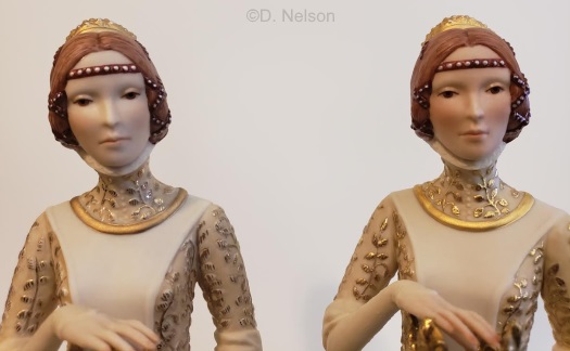
Sometimes the variations between sculptures that were produced for a fairly long time can give a clue about whether an example is earlier or later, especially if the signature style is the same on both or all of them.
 Here are two Heidi to illustrate this. There are noticeable differences in the painting (shoe color, hair color, and the color of her pinafore) but there are others as well.
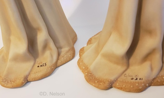
 The profile view shows that the darker Heidi has leaves on the tree stump whereas the other one does not (they were not broken off; the piece was made that way.) The slightly different positions of the arms and legs are not relevant, however, because variations like those normally occur during the bisque firing of any piece.
 A detail shot of the faces points up two more subtle variations. The Heidi on the left was painted with more attention to detail, especially the eyes which look directly ahead and look ‘real’. The other girl is looking slightly upward, and also lacks the dainty wisps of hair at the top of her forehead that the other Heidi’s artist added.
 And finally, the two flower bouquets differ as well, with yet again more realism in the darker Heidi. It is actually this variation that suggests that piece as having been made earlier in the 1966-1973 production run. In fact, she was probably painted by someone who had been at the studio since the 1950s, because the leaves have the ‘Fifties paint style’ look.
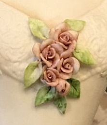
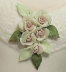 The painting of rose decorations can often vary. Scarlett (1968-194) usually wears roses that are uniformly pink but every now and then one with ‘blush’ white roses pops up.
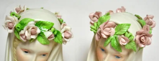 Similar variations have been spotted with the roses forming the crown of the 1981 Madonna Angelica bust.

 A much more dramatic difference is seen in an unusually intense color of the flowers in one Queen Titania’s hair! One wonders why the artist felt like switching from the usual pink scheme to red-and-white, especially since the rest of the figure was painted normally.
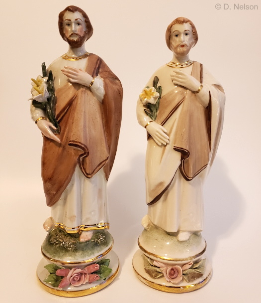 Here’s an example of three variations between the same two pieces. These are two Saint Joseph pieces from the 1950s. The one on the left has deeper colors overall; has two lilies instead of one, and also grass/moss added to the top of the base; and is 1/2″ taller. In this case the size difference was probably due to how the pieces responded in the kiln, or perhaps, because this was one of many 1950s pieces that Cybis produced from molds they purchased elsewhere, the mold manufacturer slightly reduced the size of their product.
In many cases these individual variations are what made (or still makes) collecting Cybis much more interesting and fun. There’s always the possibility that an example will turn up that makes what you used to think of as a rather ho-hum piece suddenly look interesting. And isn’t that the fun part of what ‘no two exactly alike’ was all about? 😊
Update, May 2021: A collector friend has created an excellent YouTube video that illustrates these and other variations between Cybis sculptures; it can be viewed here. Enjoy!
Name Index of Cybis Sculptures
Visual Index (for human figures/busts only)
About the Cybis Reference Archive
What is Cybis?
Images of Cybis porcelain sculptures are provided for informational and educational purposes only. All photographs are copyrighted by their owner as indicated via watermark. Please see the copyright notice in the footer and sidebar for important information regarding the text that appears within this website.
The Cybis Archive is a continually-updated website that provides the most comprehensive range of information about Cybis within a single source. It is not and never has been part of the Cybis Porcelain studio, which is no longer in business.
