The word ‘variation’, as it applied to Cybis porcelains, could have any of several meanings. It could refer to a single sculpture that was subsequently released, with additional decorative elements, as a new piece with a different name; the ‘warren’ of bunnies is a great example of that. The 1981 bunny Bon-Bon was especially prolific and ultimately appeared as 13 individually-named sartorial variations in later years!
 It also describes what the studio did with Rapunzel, releasing a consecutive series of three, of the same design but slightly different decorative elements and titled as Rapunzel (pink), Rapunzel (apricot) and Rapunzel (lilac) in 1974, 1975 and 1976 respectively.
 And, of course, there were some different-name/different-color versions of the exact same design, such as Pansies ‘China Maid’ (left) in 1972 and Pansies ‘Crinoline Lady’ (right) in 1975.
A slightly different kind of variation occurred early in the modern (Chorlton-era) studio’s history, and that was with the Goldfinch.
The Goldfinch is an interesting piece in several respects. According to the NJ State Museum’s catalog for their 1970 Cybis in Retrospect exhibit, it was produced from 1960 to 1963, but the 1978/79 Cybis catalog Appendix gives those dates as 1961-1964. It does appear on the earliest Cybis price list I have, which is Spring 1963; but that’s no help, because I don’t have the Fall 1963 or any 1964 or 1965 lists. This sculpture sold for $60 in white bisque and $75 in color, for its entire production run.
The same branch mold was used for their Magnolia, introduced in 1963 – which I assume was in the Fall because it does not appear on their Spring 1963 list – and for a third time in 1964, in a rotated orientation, for the Yellow Condesa Rose. It thus appears that the Goldfinch was the first appearance of this particular branch mold.
As for the bird mold, I’d be very surprised if it did not turn out to have been from the Holland Mold Company (as so many of the 1950s Cybis birds were) even though I haven’t yet found a “mold match.”
Although this piece was called simply Goldfinch throughout its retail history, I have found three different decorative variations thus far. Unlike the Pansies and Rapunzel examples shown above – whose titles clearly indicate that the difference in appearance was intentional – the variations of the Goldfinch likely represent on-the-fly change decisions made during the production run. But in what order?
Berry Decoration
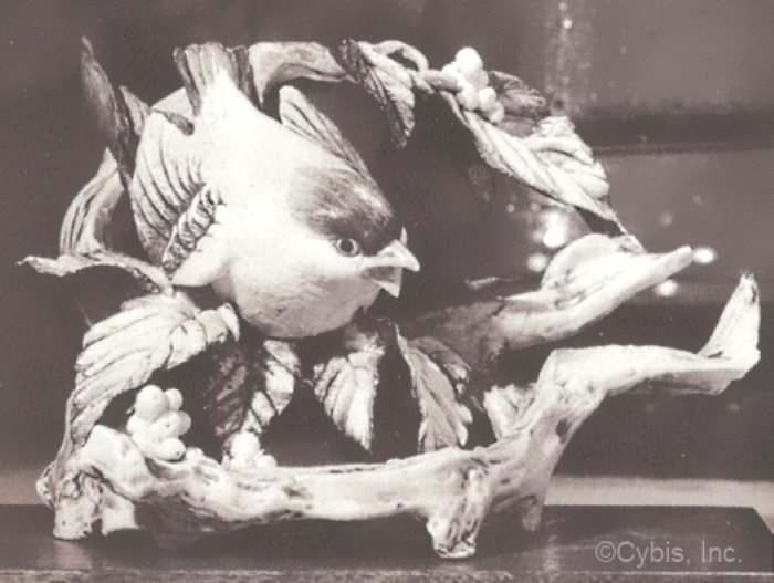 The ‘berry’ decoration is known only from this black-and-white photo that was reproduced in the 1978 Cybis catalog. The fact that it does not appear in their 1963 or 1964 catalog lends credence to the 1960-1963 production time citation; why would the studio waste layout space on a piece that was no longer available for purchase? I have never seen one of these in person, or even a color photo of one, so if any reader happens to have this on a shelf, please let me know; there’s a contact form link at the bottom of the page. It’s also possible that the piece photographed was the only one decorated in this way, or that only a few like this were made. Because it was the ‘official’ Cybis photo, however, we should assume that the earliest one(s) did look like this.
Even without a color photo, we can see that the leaves were still painted in what was the 1950s style, i.e., with darker edges and veins. The berries appear to be white, which suggests it’s intended to be the white beautyberry, Callicarpa dichotoma alba. It certainly wasn’t meant to be a yellow-berried holly!
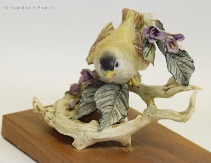
Purple Flower Decoration
At some point, the berries were replaced by flowers.
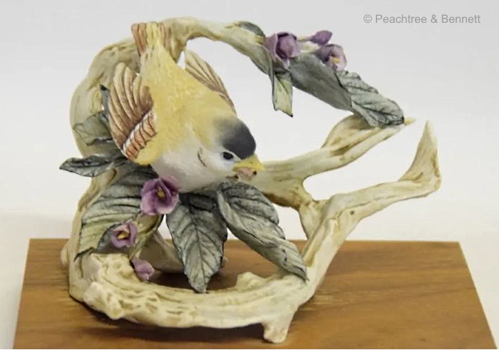
 I’ve puzzled a bit over what kind of flowers these are supposed to be. Despite the color, they are definitely not violets. Their shape somewhat suggests purple bougainvillea but everything else is wrong. I suspect/imagine that this decoration may have been prompted by a workroom exchange that went something like this:
“How about replacing those berries with flowers instead?”
“Sounds good to me; pink roses, as usual?”
“Nooo, we’ve done so many of those, and pink with that yellow bird would look awful.”
“How about dark purple flowers?”
“That’s an idea. Good contrast. But we can’t do violets, not with those leaves and that branch. Just work up some small purple flowers and tuck them in where the berries would go.”
“No problem.”
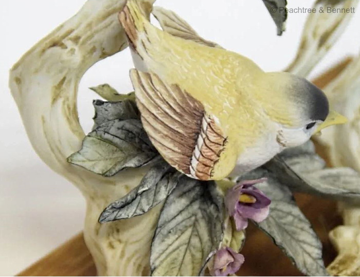 Speaking of leaves, we can see here that they are still being painted in the classic 1950s style.
White Rose Decoration
But let’s not discount that ‘roses’ idea too quickly, campers!
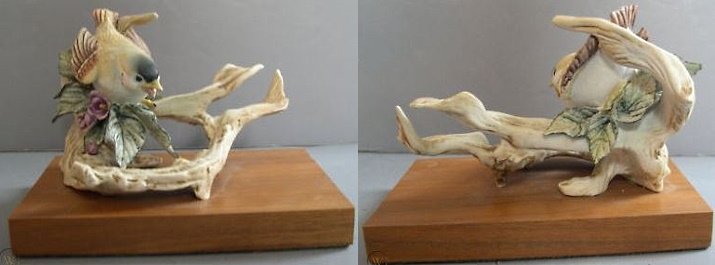
 Well, well, what have we here? A change from the purple-flowers variation to one with the wild white dog-rose, Rosa canina. In addition, there is a difference in the bird’s painting, using black instead of brown for the wings and tail feathers (which, by the way, more accurately reflects the coloration of the actual bird.) More significant are changes involving the flowers and foliage.


Actually, it’s more like what we don’t have, which is a continuation of the right-hand end of the stem. It just stops, and sits there at about the 4 o’clock position in this photo. In other words, it’s simply stuck onto that topmost section of the branch mold which, based on the photos available, seems to be shorter than on the other two versions. Considering that no rose, even a so-called climbing one, has adhesive stems like ivy or Virginia creeper, the placement of this ‘orphan’ stem section was sloppy. Seriously: If you’re going to make something botanically accurate by adding a thorny stem, at least do it correctly!
Let’s compare these decorative variations side by side:
 (A) The berries and purple-flowers versions have 1950s-paintstyle leaves emerging from beneath the bird and filling the open branch space beneath; the rose version has only one such leaf.
(B) All three versions do have a floral/berry element placed at the lower left.
(C) The rose version has leaves and a long thorny stem looping across the front of the branch, unlike the berry and purple-flowers pieces.
(D) The top section of branch and leaves is shorter than the other two (because of the different leaves and because the branch end itself has been shortened), and has an ‘orphan’ section of thorny stem
So here we have the third retail design version of the early 1960s Goldfinch, but which came first?
Signatures to the Rescue
Sometimes, when dealing with 1950s and very early 1960s Cybis pieces, the signature format can be a dating clue. Obviously, unless a berry-version Goldfinch turns up for sale online someday, we have no idea what kind of signature that version has; but we are assuming, from the very fact that it was the Cybis studio’s advertising photo, that it must have been the initially-chosen version.
 Here are the signatures on the purple-flower and rose versions. The fact that the signature on the purple one was applied in black or charcoal-gray paint points to it being produced earlier, either very soon after the berry version or – if the berried Goldfinch never made it to retail but only to the pre-introduction photo shoot – instead of it. The few “black”-signature Cybis pieces that I have seen have been from the late 1950s or very early 1960s. (Exceptions are some much later pieces that the studio added a black-1950s-stamp signature to, before sending them off to the 2019-2020 liquidation auctions, and I talk about those here.) The dog-rose Goldfinch is signed in the typical brown paint that 99.9% of post-1960 Cybis pieces are signed in (the exceptions being certain pieces that were signed in green or in gold; see the Signatures post for all the various permutations.)
 This 2013 auction lot includes both the color and the white bisque versions of the goldfinch with roses. The presence of the Cybis signature in brown, along with the copyright symbol, on the white version shows that it was a true retail piece rather than simply being unfinished; it’s the only white Goldfinch that I’ve seen so far.
 The piece above indicates that the change from berries (if indeed there were more than just one made for photography purposes) to purple flowers took place very early in the production run. The seller mentioned that it is not signed Cybis at all, but instead has its original red-edged gummed sticker with a now-faint Cybis stamp and the design number (341) written in pencil. To be honest, I am very surprised that they were still using the stickers in 1960, because I thought those were ditched during the early to mid 1950s! The sticker is another vote in favor of the production run having been from 1960 to Spring 1963, by the way. Notice that on this piece there are no leaves or flowers on the upper part of the branch. The seller cited it as being “in excellent condition” which indicates that it was probably made that way. Does that mean that the upper leaves and purple flowers were a later addition during production? If so, that would mean that there may have actually been FOUR decorative variations of the Goldfinch: (1) with berries, (2) with purple flowers on the lower section only, (3) with purple flowers on the upper and lower sections, and (4) with roses. And don’t forget the white bisque versions! Was a white bisque version available in each?? That would be quite the flock of Goldfinches!
Name Index of Cybis Sculptures
Visual Index (for human figures/busts only)
About the Cybis Reference Archive
What is Cybis?
Images of Cybis porcelain sculptures are provided for informational and educational purposes only. All photographs are copyrighted by their owner as indicated via watermark and are used here only as reference material. Please see the copyright notice in the footer and sidebar for important information regarding the text that appears within this website.
The Cybis Archive is a continually-updated website that provides the most comprehensive range of information about Cybis within a single source. It is not and never has been part of the Cybis Porcelain studio, which is no longer in business.
